Showing posts with label journal. Show all posts

Art Journaling with Jenny & Aaron Class 2


Hi guys, Yep, it's Thursday...very late Thursday...I'll spare you the details of our epic long crazy busy day., including computer issues : / 

Let's get right to the fun stuff!! Thanks for being here!

As with last week's class, we made a video slide show. Of course on it's own it only gives an idea of each step, so we included full detailed instructions for you to follow along. In the upper left corner of each photo in the slide show you'll see a title. In the instructions we've titled each step with those same titles so that you'll have an image to match each step. You can view the video once, or twice, or more...pause where you'd like, rewind, fast forward...watch it here on the blog, full screen, or on youtube. 


(There is a delay on music editing...Youtube assures us it will be tip top in a bit)

 You probably noticed right away that the pages you see here are not from my Strathmore Visual Journal. I did this spread in one of my other books of preference...a moleskine. I have only a few blank pages left in this one and I really wanted to finish it off. The pages are thin in a moleskine so you might want to reinforce them in the same way you would a marble notebook. You can glue in some heavy weight paper like card stock or kraft paper, or even collage layers of regular weight paper and then gesso or paint the pages. In the case of my book, the backs of these pages are already filled up and adorned, so my pages are already sturdy. I just needed to prep them with a coat of gesso. 

prep pages. As always, I taped the seam with masking tape.

gesso pages. And then applied a coat of gesso.

light sanding. We received a couple of comments about certain brands of gesso being chalky or gritty, or the brush strokes are heavy. A good solution for this is to give your gessoed pages a light sanding with some fine grit sandpaper. (totally optional)

mix a wash of color. We watered down some pink paint.

paint! We brushed the page with the wash...and don't worry about being neat. This is just a base coat.

lighten w/ gesso. We wanted the center area of the page to be lighter than the edges, so after the pink wash was dry on the page we then watered down some gesso and brushed it over the area we wanted lighter. let dry

gather papers. Get an idea of colors, patterns, and generally just pick some stuff you'd like to see in this spread. Most times we barely have a clue as to where the spread will end up. 

draw shape. I often like to put my focal point image within an arch or an oval. In this case I wanted my cake in an arch. So I cut an arch out of some vintage baking book pages. It's great when the ephemera has a link to the imagery. Play around with shapes...find what makes you happy.

cut out. As you can see, there is no science to my drawing and cutting...it's a decidedly primitive affair. Aaron raises an eyebrow quite often over my shoulder at how non precise I am.

adhere. Brush decoupage medium onto your page, lay down shape, press down and rub out wrinkles and bubbles. let dry.

lay papers. Make decisions as to where you want to put your selected papers. It's good to lay them down and move them, and move them, and move them...eventually you'll like what you see. 

adhere papers. Adhere papers using your usual decoupage method described above.

lay papers. I usually give my arch a base. In this case I just so happened to have the perfect paper for the job. This aqua chevron print from Heidi Swapp's Sugar Chic collection.

adhere. Adhere papers using your usual decoupage method described above.

paint shapes. I'll deliberately leave blank spots on my page knowing that I'll fill it in with some painted shapes...some doodles of paint. This scallop/cloud shape is a go-to for me. Again, it's about color and vibe...not precision painting.

seal & lighten. Make sure everything is dry. Apply a sealer coat with the medium of your choice. I used matte gel medium by Golden. Let totally dry. As we did last week, I watered down some gesso to make a wash which I then brushed over any "loud" areas...to quiet them down, or mute them.

dab gesso wash. Using a clean, dry paper towel I then dabbed the wash. Again, apply the wash and dab to your own desired effect.

add color outline. Outlining your shapes with paint is a great way to add color and texture...as well as drawing attention to your focal point. I hand painted the shape of the arch using a #10 round brush. For me, there's hand painting and then there's "art journal hand painting". In your Art Journal the rule is to loosen up and have fun. In the place of precision, instead go for bold fluid strokes.

more color! Have fun with it. Do what feels right. Again, since it's "Art Journal hand painting" I didn't worry about one color going right into the last color.

speckle & splatter.  To speckle you'll have to water down the paint in your palette the same way you did with the wash. We use a #6 round brush...load it with the watered down paint...hold the brush a few inches above your page...and just tap the metal end with your index finger. Do it to your desired effect. We love speckling for it's imperfection. It's messy and haphazard and perfect in it's own way.

distress edges. We love to "distress" the edges of our pages with paint. We use colors that contrast well. Darks against lights...lights against darks. This process is very imperfect. Just dip your thumb or finger in paint and rub the very edge of the page.

bottle cap rings. Again, we love the messy, imperfect look that bottle cap paint rings provide. Just apply paint to the rim of the cap and then press down on your page.

cut out stickers. We used our very own stickers from our Scrapbooking and Art Journaling sticker collection. We designed these ones specifically for projects like this...they're left black and white so you can color them yourself. Of course you can use actual photos in place of these...a photo of a real cake...a pic of your own adorable little face ; )...or a black and white drawing that you can cut and paste. 

color them. We used a small detail brush, round # 4, and using color washes we just simply filled in the images. You could always use color pencils, watercolor pencils, or your favorite markers.

stick them. Ours were stickers, but we actually didn't use them like stickers. We did not peel off the backing. We adhered them with decoupage medium because we wanted more thickness and opacity so that the background wouldn't show through. Similar to how we backed imagery with watercolor paper last week. After adhering with decoupage medium, wait about a minute for it to dry and then seal it.

water color pencil. Sometimes when I use pink paint I like to accent it with some red watercolor pencils. I just scribble willy nilly along the edges of the pink paint. 

add water. "Activate" your watercolor pencil with a brush dipped in water. 

dab. Much like with a color wash just dab with a paper towel until you get your desired effect. It's super easy and if you correctly sealed your pages earlier then this step can be very forgiving. Take away or add as much color as you'd like. 

draw a bubble. I like the idea of a wonky thought or dialogue bubble. I drew this in pencil on a piece of watercolor paper. You can also use card stock.

paint & speckle. I applied a coat of aqua and I didn't even worry about staying in the lines. When the aqua was dry I then used a speckling effect.

cut & adhere. Cut it out and adhere using decoupage medium. Wait about a minute for it to dry and then seal it.

washi tape time! Washi tape is a great way to add color and pattern wherever your layout is lacking.

add to seam. When working in a moleskine or any bound journal, I always add washi tape to the seam. It's just my personal preference. To me it just looks right.

more tape! Wherever you think you need a pop of color and pattern.

add a word! The word hooray happens to be made from vintage game tiles that I placed on my scanner and printed. Think outside the box! 

grab your sharpie pen. I've said it a million times...Sharpie pens are great for Art Journaling. Little bits of black are always welcome in my book and fine line details add another layer of texture.

sharpie pen time! Again, it's not about perfection. Doodling and outlining the shapes and dots around the page is a great way to add more interest and texture.

faux stitching. These are the little details that make your pages special. Use a sharpie pen to create faux stitching around shapes for a sewed on look.

tiny date tag. I think it's great to date pages. I never name a specific day...usually just month and year because I know I'll come back and mess around with a spread.

a cupcake sticker! I thought that this would be a fun pop. It's actually from a sticker and stationery collection that we designed and were sold at Michaels craft stores. I layered it on top of a paper punch and a gold foil sticker.

hand written bits. Write some words and phrases on card stock or water color paper, cut out, and adhere using your usual decoupage method.

journal spot. Now is when you add your "deep thoughts" to your thought or dialogue bubble...much like my love of french fries, chihuahuas, and coconut ice pops!

Hooray! Ok, this spread was busier and messier than last week's. And I thinks it's totally fitting that it's in MY journal.  

If you have any questions please leave a comment. We are so excited to see what you guys take away from this class. We'd love to see and hear about your art journaling, so please make sure to link your blog post back to this post so we can all visit and cheer each other on. Submit your link at the end of this post and please grab the below blog badge! We hope you enjoyed this week's class. We will be back next Thursday (much earlier in the day). Happy Art Journaling!
xo, Jenny &Aaron


Art Journaling with Jenny & Aaron class 1


Guys!! It's Thursday! Hooray! 
Oh my gosh, we have been working like two nuts over here. First, let me tell you that this was a learn-as-you-go sort of thing. We considered doing the class as an actual moving video, but it just seemed as though you really don't get perfect shots or lighting, and the narrating thing could be awkward. So we decided that the best angle of attack would be with lots of detailed photos put into a video format! Of course on it's own it only gives an idea of each step, so we included full detailed instructions for you to follow along. In the upper left corner of each photo you'll see a title. In the instructions we've titled each step with those same titles so that you'll have an image to match each step. You can view the video once, or twice, or more...pause where you'd like, rewind, fast forward...watch it here on the blog, full screen, or on youtube. We definitely think that this was the clearest way to get our points across and give you crisp, bright images for you to reference. 

We also went back and forth over whether we'd use both of our journals or just one journal. We decided to collaborate on one spread in one journal. If we did two spreads there would be like 200 photos! And we already kinda went photo crazy...which is another reason why we needed to go with a slideshow in video format. It's exciting that this has forced us to jump into using our youtube channel! eeee! This could get nuts! Just a warning. I'm thinking some vlogs could happen too.  

This week we decided to use Aaron's journal. So he had the initial choice as far as color scheme. But the singularity stops there. This was definitely a full on collabo. So much so, that I'm wishing this spread was in my journal! Haha is that weird?


( in the first steps below we're using Kraft paper, but you can substitute it for any paper at all. Use all the same methods described but change the words Kraft paper to whatever you like. These steps simply describe how to add a paper base to your pages. You can use a full sheet or even torn or cut scraps. Jenny often uses phonebook pages to thicken up her moleskin pages.)

reinforcing with kraft paper. Since marble notebook pages are flimsy we like to reinforce them. In this case using one of our favorite supplies, Kraft paper. Just cut a piece thats a tiny bit bigger than your page. You can trim off the excess later. And even if you aren't using a marble notebook Kraft paper is still a great base to work upon. You can glue it into any journal.

brush on medium. With your 3/4 inch brush, brush on a thick layer of decoupage medium. You'll notice the notebook page rippling quite a bit but don't worry, the Kraft paper will solve that. 

lay kraft paper down. Once you've got a nice thick coat of medium then lay down your piece of Kraft paper. Every time we teach a class we'll see that people like to lay the paper down and then immediately brush medium on top of it. We don't not subscribe to that method...brushing wet on top of wet will add bubbles and ripples. As described in the next step we smooth out the paper with our hands and let it dry and fully adhere.

smooth paper. With heavy hands smooth out the Kraft paper, eliminate any ripples or bubbles. Keep on rubbing until you know that it's fully adhered.

crease edges. To make sure that you get a nice adhesion all the way to the ends of the page run your thumb or finger along the edge to crease it.

flip page and trim. If you have excess paper turn the page so you can see the excess and trim it off with a scissor.

gesso pages. For this spread we decided that one page would be Kraft paper and the facing page we'd reinforce, or bolster, with a thick coat of gesso. In this case we used Americana brand gesso. It's super thick and when it's dry your page will almost feel like vinyl. We really like this.

reinforce seam with tape. After your gesso is dry run a piece of masking tape down the seam of the journal. This actually does reinforce your binding and it makes for a smoother transition from page to page.

select papers and elements. Think about what type of color scheme you'd like, what types of patterns, bits and pieces. This is the fun part. We wanted to go with a tight palette...a more masculine feel being that it's Aaron's journal. He has an affinity for the letter A and the number 9. 

tear and cut papers. With a bit of an idea of where you'll place things start tearing and cutting your papers and elements. 

play around with layout. Before gluing anything down it is always a good idea to play around with your layout. Just place things on the pages until it feels right. There are no rules.

adhere papers with medium. To adhere papers brush on decoupage medium and lay the papers on the wet medium. It's better to be generous with the medium. If you apply too little you won't get good adhesion.

smooth papers. Just as you smoothed and rubbed the Kraft paper, do the same in this step. Eliminate ripples and bubbles. But be gentler than you were with the tougher Kraft paper. 

consider your design. At this point your pages will start looking like something. Take time to pull back and consider where you really want to go with the spread...like where you might place writing spots...or photos...or doodles later on.

finish adding elements. Add the next layers of stuff. The details like our letter A and number 9. The scrolly writing spot. Your points of interest. All of ours are adhered with the same decoupage medium.

trace shapes. We used a couple bottle caps to trace circles onto the page. Why? because we thought a couple of white circles would look good right there. And later we could add some text maybe.

paint in shapes. We used a #6 round brush to paint in our circles with white paint. It only took one coat because it was quality white paint. You might need two coats if you want a solid look.

seal pages. After all of our papers that we adhered were dry and after the painted circles were completely dry we then sealed our pages with a coat of matte finish gel medium by Liquitex...we also recommend Golden brand. When sealing pages be sure to apply a thick even coat...and get FULL coverage. Later on, if you apply washes etc...if you miss any areas with this sealer coat then those areas will be "vulnerable"...meaning washes will totally screw up any raw sections of paper. So just be sure to apply a nice even coat.

make a color wash. We used a tan paint that sorta matched the Kraft paper, but you can use ANY color you like. With a #6 round brush we dabbed some water into the well of paint on the palette. It's not an exact science...you just want to water down the paint a bit. 

brush on wash. We thought the white was a bit stark so we "aged" it a bit with the tan wash. Just brush it on the areas where you want the wash. And start small and light until you get a feel for it. Don't  brush the wash on a giant swath of page because you might have trouble working with it in the next step. The key is to go little by little. Maybe like 4 square inches at a time.

blot wash. With a paper towel blot the wash that you've brushed on. Again, one section at a time.

blot and dab wash. This is pretty much the same step but we made it into two just to emphasize the blotting and dabbing. You're just doing it until you get your own desired effect. We wanted a parchmenty, tobacco stained feel. You can do your whole page or just accents.

speckling. We did speckling in two different colors...black and pale aqua. To speckle you'll have to water down the paint in your palette the same way you did with the wash. We use a #6 round brush...load it with the watered down paint...hold the brush a few inches above your page...and just tap the metal end with your index finger. Do it to your desired effect. We love speckling for it's imperfection. It's messy and haphazard and perfect in it's own way.

crosshatch with DIY stamp. Last weekend we made some stamps by wrapping yarn around a wood block. Here we applied paint to the stamp and created a crosshatch design. We really only wanted an accent up in the corner of the page...bet you can stamp all over the place if you want.

gesso wash to mute areas. Sometimes you want certain colors or patterns on your page to be less bold. In this case we watered down some gesso on our palette...the same way we made a wash with paint. Then brush the gesso wash on the areas that you want to mute and blot or wipe off with a paper towel. Again, do this to your own desired effect.

gesso and paint wash. This is pretty much the same as the previous step but we added some of the tan paint to our gesso wash. We just wanted to carry over some tan to match the Kraft paper on the opposite page.

consider your progress. At this point you've accomplished a lot and your pages are really starting to look like something. Now is when to consider some fun details...the little things...maybe add small pops of color and texture...doodles...heck, even glitter. Pull out some supplies. 


"glue stick" paint dots. We seem to always add messy, randomly spaced polka dots. We do this by either dipping a glue stick into paint or the eraser end of a pencil. Just dip your round tip object into whatever paint color you like and press dots onto your pages in areas that might need a little pop of color.

bottle cap paint rings. Again, we love the messy, imperfect look that bottle cap paint rings provide. Just apply paint to the rim of the cap and then press down on your page.

"distress" edges with paint. We love to "distress" the edges of our pages with paint. In this case we used colors that contrasted well. Aqua against the Kraft paper, and white against the aqua polka dot paper. This process is very imperfect. Just dip your thumb or finger in paint and rub the very edge of the page.

backing photocopy with watercolor paper. We knew we wanted to add an old photo to this spread, and we knew it was gonna be placed right on top of those bold stripes. Since the photo was a photocopy we had to first back the photocopy with watercolor paper. This way those stripes won't show right through the paper when we adhere it to the page. It also bolsters the photo a bit. Adds some texture to your page. To back it with watercolor paper just brush decoupage medium onto watercolor paper, lay the photocopy down on the wet medium, and smooth out just like you did when applying your papers to your pages. Then cut out. Again, we did not brush medium over the photo. 

adhere photo. Now adhere the photo in the desired spot using the same method as above. We often use a clean, dry paper towel to press down photocopies just so our possibly damp fingertips don't muss the picture.

faux stitching with sharpie pen. These are the little details that make your pages special. Use a sharpie pen to create faux stitching around shapes for a sewed on look.

outline paint dots with sharpie pen. Again, it's not about perfection. Doodling and outlining the shapes and dots around the page is a great way to add more interest and texture.

add bits of washi tape. Washi tape is so great for Art Journaling. It's often one of the very last elements we'll add to a page. In this case we wanted some metallic gold to set off the vintage photo. Even though Mr. Moustachio is securely adhered already, the washi tape gives him a scrapbooky feel.

Hooray! Yes, you now have a dazzling spread. For this very first class we wanted to take our pages to the step right before you write in them. Adding text is a very fun step and you might fill in your pages with words right away...or you might take your time and wait until you have your thoughts in order and you can really make your Journal statement. We have so so many pages that are at this stage...just waiting for text.
---------------------------------------------------------------------------------------------------


Ok guys, this was our first week. As you can see, there are so so many steps and the text takes up a lot of space. This is why we went with the slide show video format instead of trying to squeeze the photos and text into one post. That would be a whole lot of scrolling. If you have any questions or suggestions...please please send them our way. We would love to hear from you and see your results. Below is a link-up that is reserved specifically for this class. So if you have a blog and you are participating in Art Journaling with Jenny & Aaron...This link-up is for you. We want to hear all about it and see all about it! Whatever you do this week...call it "homework" if you want...or if that conjures bad memories...call it something else...just try make it a point to come back to this post and use the link-up below. It will be so much more fun for ALL involved...getting to see and hear about your own Art Journaling. 

Again, our pages are an example...it's just what we do...our style. Don't for one second think that there is one ounce of rigidity in Art Journaling. Do what you want...How you want. We just hope we can offer a hand.
Also, we'd love for you to grab the button above and put it on your page, spread the word, all that good stuff. This was really fun for us...and if we've added even a smidge of creativity to you life then we are as happy as can be! 

'til next Thursday! Keep on Art Journaling!
xo, Jenny & Aaron

P.S. If you are just joining us, we blogged all of our favorite supplies here.


journals journals everywhere!


I mentioned in my last entry that I had printed out my 30 days of photos and was ready to start a happy lil journal project. The book I am using is the perfect length and size for the pics. I didn't want to do big page layouts or lots of additional journaling or anything. It's really all about the photos. And I think this will be such a fun keepsake! :) So here are Day's 1 & 2. Reliving that awful 2 days of the gas leak and no running water! Ohh boy..that hair! Though I am proud to have been a good sport about it! ;)
I have a ton on my plate right now...with orders, and the two very exciting events coming up...so I'm sorta at a snails pace with this journal...but I will indeed work on it whenever I get a moment! And I'll be sure to share with you guys! :) you can follow along on flickr as well! :)

And while I'm on the very close to my heart topic of Art journaling...here are some pages in progress from one of my in progress journals. Nothing fancy...nothing spectacular...really just relaxing with the process, not overthinking, and having fun. I really can't see an art journal as a place to stress out...or to get upset at mess ups...or a random "lame page" haha. It's just a fun escape. A place to try things out...flush out ideas and emotions. I really love journaling, and I'm so so excited to be hosting a workshop this October!! It will be an ALL day affair!! Imagine...8 hrs of art journaling with a bunch of awesome peeps who totally Get You!! :) What a great feeling and way to spend a fall day!! If you have been looking for something like this, Something that will feed your soul....treat yourself to this amazing retreat!! Art Is..in Danbury CT this October! It isn't too late to sign up! We would LOVE to have you!! It is going to be a FUN FUN time!! Lots of brand new tips, tricks, ideas, and techniques to share! :)

For more info click here! :)


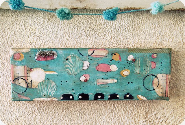
I've also been doing some personal painting lately. More abstract than you are used to seeing from me/us. This type of painting is so relaxing for me...totally therapeutic. It's all about vibe, color, feel, mood, shape, and flow. I'm hoping to start a small collection of them. They really make me happy. Aaron is a big big fan of art that's not representational, so he likes these new pieces I'm working on a lot. No rules, no restrictions. :)

ok, see you all soon! xoxo, Jenny